Broadway 3D Italic
Decorative / Art DecoDesigned by Morris Fuller Benton

Designed by Morris Fuller Benton (Original Concept)
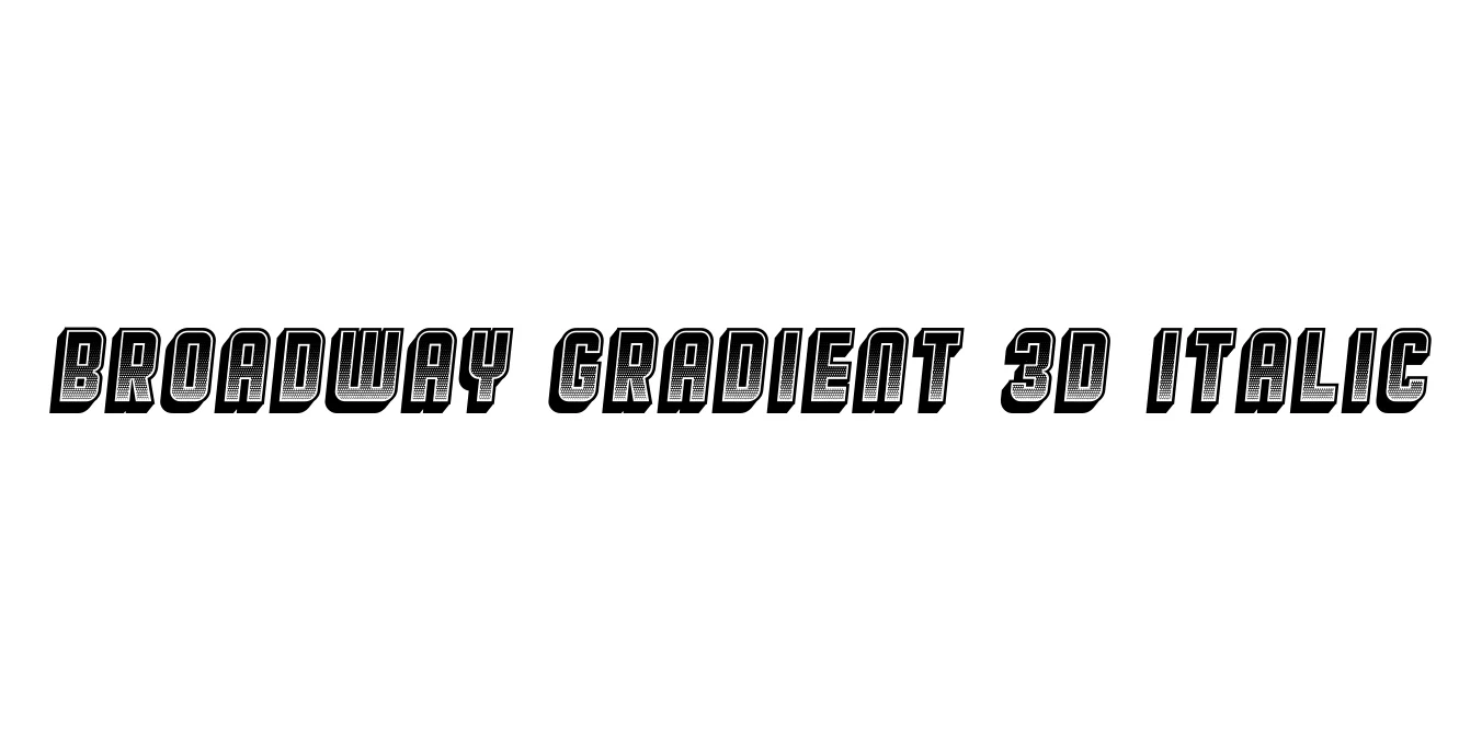
| Font Name | Broadway Gradient 3D |
| Style | Italic |
| Category | Display / Decorative |
| Designer | Morris Fuller Benton (Original Concept) |
| Copyright | Copyright (c) 2018 by Vladimir Nikolic. All rights reserved. |
| License | Free for Personal Use |
| Total Character | 71 |
| Recommended Line Height | 0.75 |
| Ascent | 694 |
| Descent | 58 |
| Units Per em | 1000 |
| Total Vertical Range | 752 |
| Max Advance Width | 620 |
| Max Advance Height | N/A |
| Underline Position | -75 |
| Similar Fonts | Broadway, Plaza, Park Avenue, Blippo, Futura Black |
Broadway Gradient 3D Italic is a stylized evolution of the classic Broadway typeface, which was originally designed by Morris Fuller Benton in 1927. As a cornerstone of the Art Deco movement, the typeface is known for its high-contrast strokes and geometric elegance. This specific variant introduces a 3D perspective and a gradient shadow, transforming the flat, traditional look into a dynamic, three-dimensional display font that captures the glitz and glamour of mid-20th-century theater and nightlife.
The addition of an italic slant further enhances the sense of motion and modernity. While the original Broadway was intended for advertising and display, this Gradient 3D Italic version is specifically engineered for high-impact visual projects such as titling, digital headers, and retro-themed branding. It remains a popular choice for designers looking to blend vintage nostalgia with contemporary digital effects.
Creating bold, high-contrast brand identities with a classic feel.
Promoting jazz festivals, theatrical performances, or gala events.
Generating high-impact hero sections for vintage-themed websites.
Adding a sense of luxury and depth to premium product labels.

Designed by Morris Fuller Benton
Designed by Morris Fuller Benton (Original Design)

Designed by Morris Fuller Benton
Designed by Morris Fuller Benton