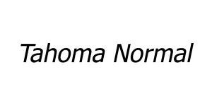
Verdana Normal
Sans SerifDesigned by Matthew Carter

Designed by Linn Boyd Benton
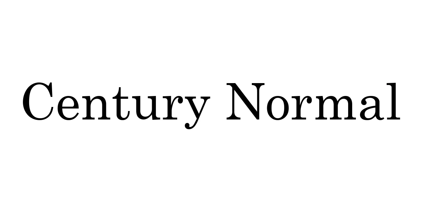
| Font Name | Century |
| Style | Normal |
| Category | Serif |
| Designer | Linn Boyd Benton |
| Copyright | Digitized data copyright (C) 1992-1997 The Monotype Corporation. All rights reserved. Century™ is a trademark of The Monotype Corporation which may be registered in certain jurisdictions. |
| License | Free for Personal Use |
| Total Character | 672 |
| Recommended Line Height | 1.2 |
| Ascent | 2019 |
| Descent | 442 |
| Units Per em | 2048 |
| Total Vertical Range | 2461 |
| Max Advance Width | 2638 |
| Max Advance Height | N/A |
| Underline Position | -205 |
| Similar Fonts | Century Schoolbook, Century Expanded, Miller, Clarendon |
The Century Normal typeface was originally designed in 1894 by Linn Boyd Benton. It was commissioned by Theodore Low De Vinne for use in The Century Magazine, aiming to create a face that was more legible than the standard thin-stroke typefaces of the era. The result was a robust, well-balanced serif with a large x-height that significantly improved readability in dense magazine layouts.
Later, the design was expanded upon by Morris Fuller Benton at American Type Founders (ATF), leading to iconic variations like Century Expanded and Century Schoolbook. Its clean lines and structural integrity have made it a staple in print media, educational publishing, and legal documentation for over a century, maintaining its status as one of the most functional and timeless serif fonts in typographic history.
Ideal for magazines and newspapers requiring high readability in long-form text.
Perfect for textbooks and academic papers due to its clear, balanced proportions.
Widely used for official reports and contracts where a formal and clear structure is required.

Package Size: 161.4 KB
Available Formats: .TTF
Designed by Matthew Carter
Designed by Mohammed Ahsan
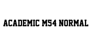
Designed by Mohammed (M54)
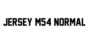
Designed by Matthew Carter