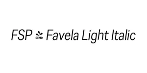
FSP - Favela Light Italic
Sans SerifDesigned by Maciej Majewski
Designed by Jean-Baptiste Morizot
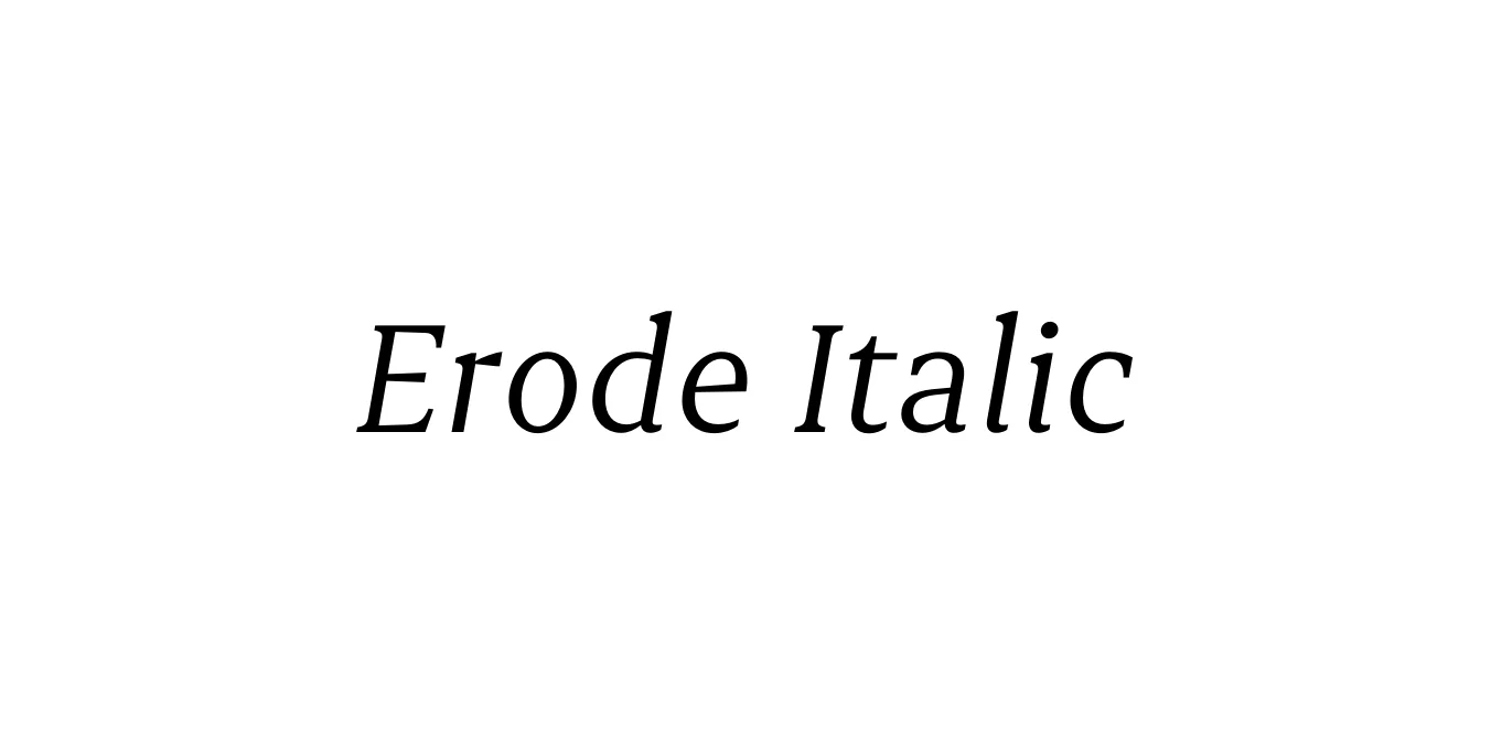
| Font Name | Erode |
| Style | Italic |
| Category | Serif |
| Designer | Jean-Baptiste Morizot |
| Copyright | Copyright 2016-2021 Indian Type Foundry. All rights reserved. |
| License | Free for Personal & Commercial Use |
| Total Character | 381 |
| Recommended Line Height | 1.15 |
| Ascent | 930 |
| Descent | 220 |
| Units Per em | 1000 |
| Total Vertical Range | 1150 |
| Max Advance Width | 1498 |
| Max Advance Height | N/A |
| Underline Position | -100 |
| Similar Fonts | Playfair Display, Miller Italic, Bodoni |
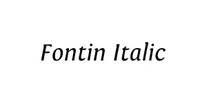
Erode is a contemporary serif typeface family designed by Jean-Baptiste Morizot and released by the Indian Type Foundry. It is characterized by its high-contrast strokes and elegant, sharp terminals, making it a sophisticated choice for modern editorial design. The italic version specifically introduces a graceful slant that maintains the font's legibility while adding a rhythmic, calligraphic flair to the text.
The design bridges the gap between traditional Transitional serifs and modern display typography. Its refined proportions and crisp details allow it to perform exceptionally well in fashion magazines, luxury branding, and high-end digital interfaces. Erode Italic offers a perfect balance of personality and professional utility, ensuring that long-form passages remain engaging and visually appealing.
Perfect for magazines, journals, and long-form articles that require a sophisticated look.
Ideal for luxury brands and high-end corporate identities needing a touch of class.
Well-suited for fashion blogs and lifestyle websites seeking an elegant typographic voice.

Designed by Maciej Majewski
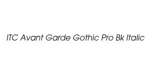
Designed by Herb Lubalin & Tom Carnase
Designed by Jos Buivenga
Designed by Akuru