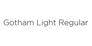
Mindful Angelic Regular
ScriptDesigned by Arizal (Gisella Studio)
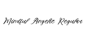
Designed by Tobias Frere-Jones
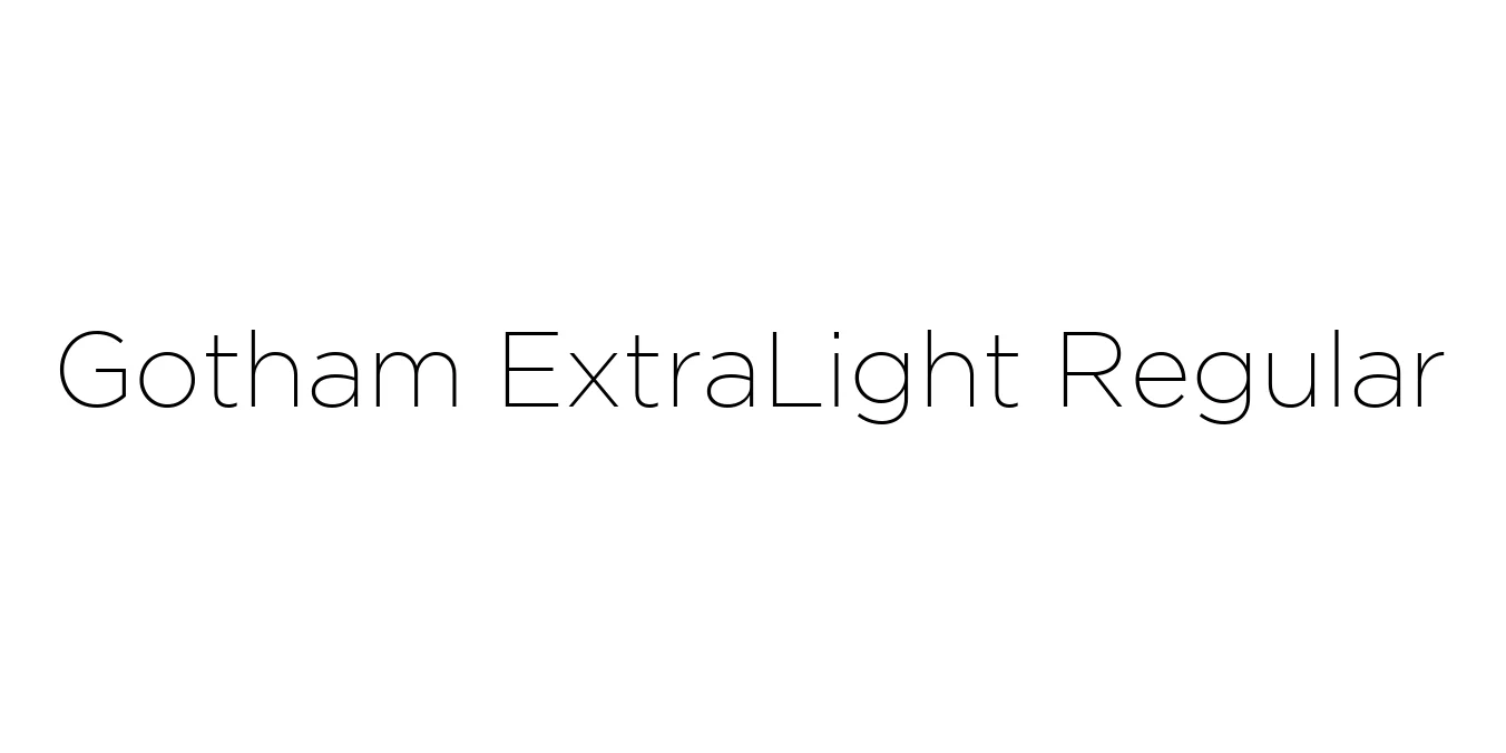
| Font Name | Gotham ExtraLight |
| Style | Regular |
| Category | Geometric Sans-Serif |
| Designer | Tobias Frere-Jones |
| Copyright | HTF Gotham Copr. 2003 The Hoefler Type Foundry, Inc. Info: www.typography.com |
| License | Commercial License Required / Personal Use Only |
| Total Character | 229 |
| Recommended Line Height | 1.06 |
| Ascent | 893 |
| Descent | 165 |
| Units Per em | 1000 |
| Total Vertical Range | 1058 |
| Max Advance Width | 1179 |
| Max Advance Height | N/A |
| Underline Position | -123 |
| Similar Fonts | Montserrat, Proxima Nova, Raleway, Avenir Next |
Gotham ExtraLight Regular was designed by the renowned typographer Tobias Frere-Jones in 2000. Originally commissioned by GQ magazine, the typeface was inspired by the architectural signage and basic lettering found throughout New York City, particularly the iconic Port Authority Bus Terminal. This geometric sans-serif captures a uniquely American aesthetic that balances industrial strength with modern sophistication.
The ExtraLight weight specifically provides a delicate and airy quality to the family. While the heavier weights of Gotham are known for their authority, the ExtraLight variant offers a refined elegance that is highly effective for high-end branding and editorial layouts. It maintains the rigid geometric integrity of the original design while providing a clean, minimalist look that thrives in large-scale display applications.
Perfect for luxury magazine headlines and sophisticated pull quotes.
Ideal for minimalist and high-end fashion or technology brand identities.
Excellent for large hero sections and clean, modern digital interfaces.

Package Size: 65.4 KB
Available Formats: .TTF
Designed by Arizal (Gisella Studio)
Designed by Tobias Frere-Jones
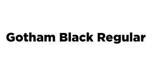
Designed by Tobias Frere-Jones

Designed by Tobias Frere-Jones