feather Regular
Icon / DingbatsDesigned by Cole Bemis
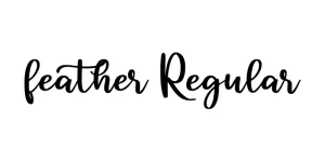
Designed by Jonathan Hill (The Northern Block)
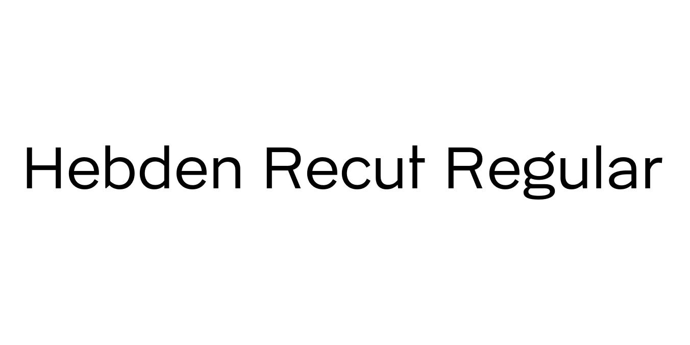
| Font Name | Hebden Recut |
| Style | Regular |
| Category | Sans Serif |
| Designer | Jonathan Hill (The Northern Block) |
| Copyright | Copyright © 2025 by Lewis McGuffie & David Williams. All rights reserved. |
| License | Free for Personal Use |
| Total Character | 580 |
| Recommended Line Height | 1.45 |
| Ascent | 1100 |
| Descent | 353 |
| Units Per em | 1000 |
| Total Vertical Range | 1453 |
| Max Advance Width | 1331 |
| Max Advance Height | N/A |
| Underline Position | -125 |
| Similar Fonts | Johnston, Gill Sans, Akzidenz-Grotesk |
Hebden Recut Regular is a meticulous digital revival inspired by the unique hand-painted lettering found in Hebden Bridge, West Yorkshire. The typeface is specifically based on the historical signwriting work of Harry Ward, an artisan whose distinctive style defined the local visual landscape in the early 20th century. This 'Recut' version captures the idiosyncratic, high-waisted proportions of English grotesque lettering, blending historical charm with modern digital precision.
The design features robust, vertical forms and a subtle industrial aesthetic that reflects its British heritage. It is characterized by its wide apertures and structural stability, making it highly effective for display purposes. Whether used in a contemporary or vintage context, the font provides a sense of craftsmanship and authenticity that is rooted in the rich history of Northern English typography.
Perfect for heritage-inspired brand identities and local business logos.
Excellent for bold headlines and atmospheric pull-quotes in print media.
High legibility and distinct character make it ideal for storefronts and wayfinding.
Highly effective for typographic-heavy poster designs and event promotion.

Designed by Cole Bemis
Designed by Yusuf Sangadji
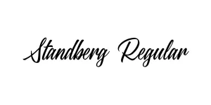
Designed by Julien Fincker

Designed by Apple Inc.