ITC Franklin Gothic Std Bk Cp Regular
Sans SerifDesigned by Victor Caruso

Designed by Nick Curtis
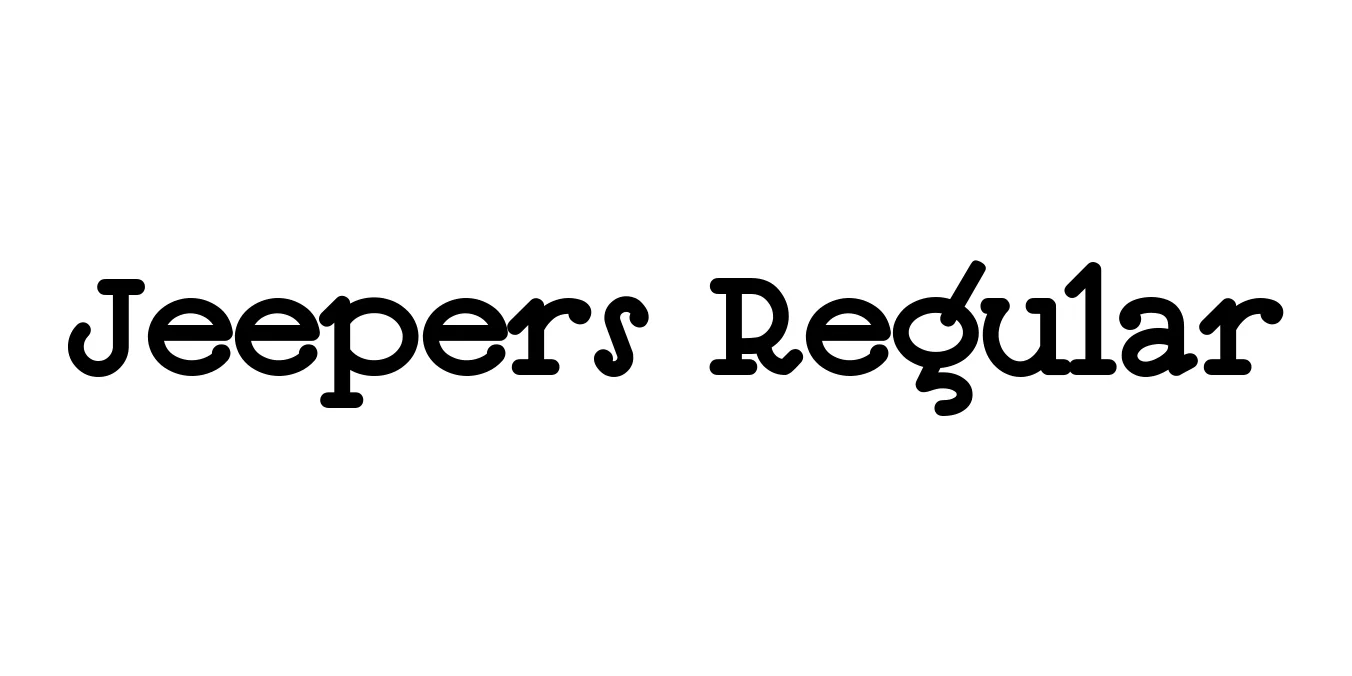
| Font Name | Jeepers |
| Style | Regular |
| Category | Display |
| Designer | Nick Curtis |
| Copyright | (c) 1999 Nick Curtis. All Rights Reserved. Generated by Fontographer 3.52 |
| License | Free for Personal Use |
| Total Character | 394 |
| Recommended Line Height | 1.11 |
| Ascent | 866 |
| Descent | 246 |
| Units Per em | 1000 |
| Total Vertical Range | 1112 |
| Max Advance Width | 934 |
| Max Advance Height | N/A |
| Underline Position | -80 |
| Similar Fonts | Hobo, Bouncing, Nickelodeon, Ad Lib |
Jeepers Regular is a whimsical and high-energy display typeface designed by the prolific Nick Curtis. The font's origins are rooted in the hand-lettered title cards of a 1930s movie poster, specifically capturing the exuberant and slightly eccentric spirit of the early sound era in cinema. Its bouncy baseline and varied stroke weights give it a rhythmic quality that feels both vintage and alive with motion.
Structurally, the typeface blends Art Deco geometry with a cartoonish, informal sensibility. This unique combination makes it highly versatile for projects that require a nostalgic touch without feeling overly formal. Since its release, Jeepers has become a staple for designers looking to convey friendliness, playfulness, and a sense of retro-inspired fun in their typography.
Perfect for high-impact titles that need a touch of whimsy and movement.
Its friendly and bouncy nature makes it ideal for juvenile book covers.
Excellent for branding that wants to appear approachable, fun, and creative.
Captures the eye immediately with its retro cinematic and festive feel.

Designed by Victor Caruso
Designed by Dicky Nugraha (Zeune Type Foundry)

Designed by Ray Larabie (Typodermic Fonts)

Designed by Prioritype Co