CooperFiveOpti Black Regular
Display SerifDesigned by Oswald Bruce Cooper

Designed by Patrick Griffin
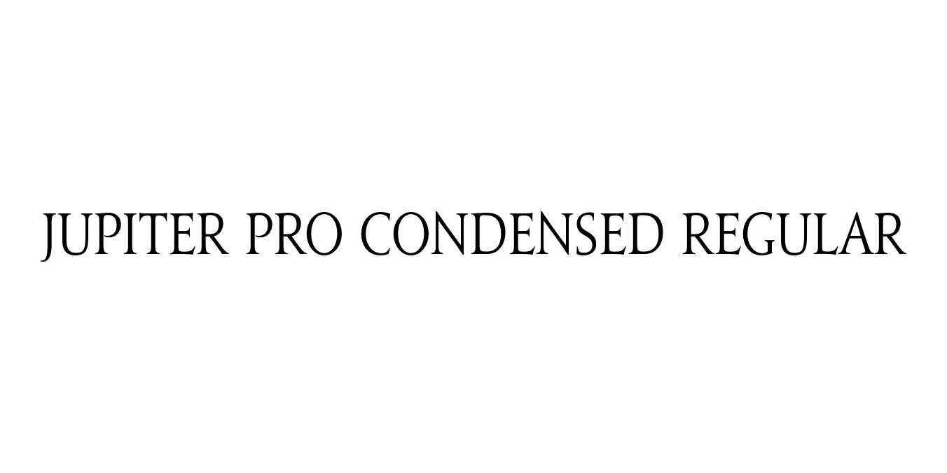
| Font Name | Jupiter Pro Condensed |
| Style | Regular |
| Category | Serif |
| Designer | Patrick Griffin |
| Copyright | Copyright © 2007-2019 Canada Type. All rights reserved. |DCNT |
| License | Commercial (Check License) |
| Total Character | 827 |
| Recommended Line Height | 1.4 |
| Ascent | 1078 |
| Descent | 325 |
| Units Per em | 1000 |
| Total Vertical Range | 1403 |
| Max Advance Width | 1606 |
| Max Advance Height | N/A |
| Underline Position | -75 |
| Similar Fonts | Trajan, Cinzel, Adobe Jenson, Centaur |
Jupiter Pro Condensed Regular is a sophisticated Roman-style typeface inspired by the monumental inscriptions of ancient Rome, specifically those found on the Trajan column. Designed by Patrick Griffin and released through Canada Type, this font serves as a modern digital interpretation of classical lapidary letterforms. The condensed weight provides a space-saving alternative that retains the regal and timeless aesthetic of the original, making it a staple for high-end design projects.
The typeface is characterized by its sharp serifs and high contrast, offering a rhythmic structure that conveys authority and history. While many Roman fonts focus solely on capitals, Jupiter Pro includes a versatile lowercase set, expanding its utility for editorial layouts and modern branding. It is widely favored in the cinematic industry, luxury packaging, and architectural signage where a sense of prestige and permanence is essential.
Ideal for headlines in high-end magazines and journals.
Perfect for logos in fashion, architecture, and luxury services.
A top choice for cinematic title treatments and promotional graphics.
Adds a premium feel to high-end consumer goods like wine and cosmetics.

Designed by Oswald Bruce Cooper
Designed by Apple Inc.

Designed by Luna Type

Designed by Dmitry Rastvortsev