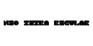
Kate Black Regular
SerifDesigned by Karyna Manukian

Designed by Anton Scholtz

| Font Name | Kate Disp |
| Style | Regular |
| Category | Serif / Display |
| Designer | Anton Scholtz |
| Copyright | Copyright 2019 Adobe Systems Incorporated. All rights reserved. |
| License | Free for Personal Use |
| Total Character | 149 |
| Recommended Line Height | 1.2 |
| Ascent | 1200 |
| Descent | 0 |
| Units Per em | 1000 |
| Total Vertical Range | 1200 |
| Max Advance Width | 1782 |
| Max Advance Height | N/A |
| Underline Position | -75 |
| Similar Fonts | Bodoni, Didot, Playfair Display, Lust |
Kate Disp Regular is a sophisticated display serif typeface that epitomizes luxury and modern elegance. Designed by Anton Scholtz, this font family is characterized by its extreme contrast between thick and thin strokes, making it a perfect choice for high-end editorial layouts and fashion branding. The 'Display' variant is specifically engineered to maintain its sharp details and graceful curves at large scales, ensuring that headlines remain crisp, impactful, and visually striking.
Drawing inspiration from the classic 18th-century Didone styles, Kate Disp Regular adds a contemporary twist with its unique terminal treatments and refined proportions. It has become a staple for designers looking to convey a sense of prestige and glamour. Whether used in print for glossy magazine covers or digitally for luxury e-commerce sites, this font provides a timeless aesthetic that commands attention while remaining impeccably legible in display contexts.
Ideal for headlines and cover titles in high-end magazines.
Perfect for luxury logos and premium packaging designs.
Adds a sophisticated and formal touch to social stationery.
Great for large-scale posters and billboard typography.

Package Size: 34.4 KB
Available Formats: .OTF
Designed by Karyna Manukian
Designed by Jérémie Cavard

Designed by Gunarta