Obviously Blck Italic
Sans SerifDesigned by James Edmondson

Designed by James Edmondson
| Font Name | Obviously Demo Cond Blck |
| Style | Italic |
| Category | Sans Serif |
| Designer | James Edmondson |
| Copyright | N/A |
| License | Demo / Commercial License Required |
| Total Character | 66 |
| Recommended Line Height | 1.57 |
| Ascent | 1300 |
| Descent | 265 |
| Units Per em | 1000 |
| Total Vertical Range | 1565 |
| Max Advance Width | 465 |
| Max Advance Height | N/A |
| Underline Position | -75 |
| Similar Fonts | Druk, Helvetica Compressed, Impact, Compacta |
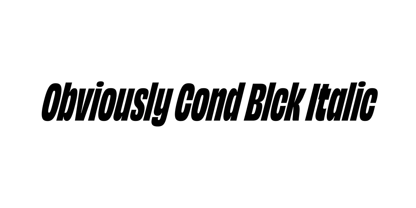
Obviously Cond Blck Italic is a standout member of the expansive Obviously family, designed by James Edmondson for Ohno Type Co. This typeface is a modern interpretation of the expressive, often clunky, American vernacular lettering found in mid-20th-century signage. The Condensed Black Italic variant is specifically crafted to provide maximum visual weight within a narrow horizontal footprint, offering a sense of urgency and momentum through its aggressive slant and dense black color.
Technically, the font excels in high-impact environments where space is at a premium. Unlike many ultra-bold condensed faces that sacrifice legibility for style, Obviously maintains clear counters and distinct character shapes. This balance makes it a favorite among contemporary graphic designers for editorial headlines, loud branding systems, and digital interfaces that require a bold, unapologetic typographic voice that feels both nostalgic and futuristic.
Perfect for loud, attention-grabbing titles in magazines and websites.
Ideal for event promotion and graphic layouts requiring high visibility.
Great for wordmarks that need to convey strength and modern style.
Excellent for punchy text overlays on high-contrast imagery.

Package Size: 8.5 KB
Available Formats: .OTF
Designed by James Edmondson
Designed by James Edmondson

Designed by James Edmondson
Designed by James Edmondson