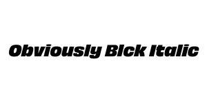
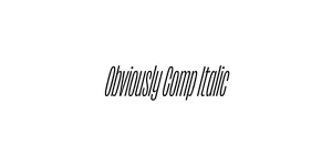
Obviously Blck Italic
Sans SerifDesigned by James Edmondson
Designed by James Edmondson
| Font Name | Obviously Demo Cond Lght |
| Style | Italic |
| Category | Sans Serif |
| Designer | James Edmondson |
| Copyright | N/A |
| License | Demo |
| Total Character | 66 |
| Recommended Line Height | 1.57 |
| Ascent | 1300 |
| Descent | 265 |
| Units Per em | 1000 |
| Total Vertical Range | 1565 |
| Max Advance Width | 453 |
| Max Advance Height | N/A |
| Underline Position | -75 |
| Similar Fonts | Klavika, FF Meta, Acumin Pro |
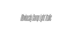
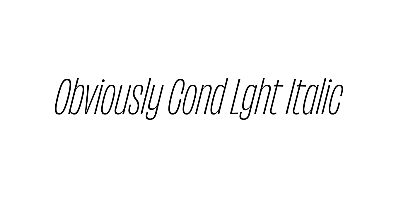
Obviously was designed by James Edmondson and released through his foundry, Ohno Type Co, in 2018. The family is a versatile sans-serif that explores the extremes of width and weight, ranging from compressed to extended. The Condensed Light Italic variant offers a sleek, modern aesthetic with a distinct slant that emphasizes forward motion and energy without sacrificing legibility or personality.
Inspired by the grit and character of mid-20th-century vinyl record covers and vintage signage, Obviously brings a playful yet professional vibe to graphic design projects. Its unique construction balances quirky personality with geometric precision, making it a favorite for designers looking to inject a sense of "California cool" into contemporary branding, editorial layouts, and high-impact digital interfaces.
Perfect for pull-quotes and sidebars that need to stand out with a modern, narrow edge.
Ideal for fashion or tech brands seeking a stylish, sophisticated profile.
Great for high-impact headlines that require a condensed footprint in tight spaces.
Excellent for dynamic, slanted text in Instagram stories or digital headers.

Designed by James Edmondson
Designed by James Edmondson
Designed by James Edmondson
Designed by James Edmondson