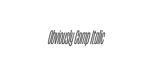
Obviously Blck Italic
Sans SerifDesigned by James Edmondson
Designed by James Edmondson
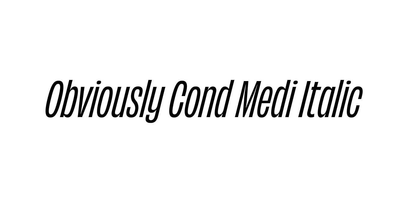
| Font Name | Obviously Demo Cond Medi |
| Style | Italic |
| Category | Sans Serif |
| Designer | James Edmondson |
| Copyright | N/A |
| License | Commercial License Required / Demo available |
| Total Character | 66 |
| Recommended Line Height | 1.57 |
| Ascent | 1300 |
| Descent | 265 |
| Units Per em | 1000 |
| Total Vertical Range | 1565 |
| Max Advance Width | 474 |
| Max Advance Height | N/A |
| Underline Position | -75 |
| Similar Fonts | Druk, Impact, Compacta, Helvetica Compressed |
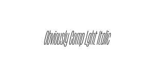
Obviously is a comprehensive sans-serif family designed by James Edmondson of OH no Type Co. Released in 2018, the family was built to explore the extremes of width and weight, ranging from Wide to Condensed. The Condensed Medium Italic weight provides a sleek, energetic, and sophisticated slant that is specifically engineered for high-impact visual communication where horizontal space is limited.
The design of Obviously takes deep inspiration from 20th-century American signage and utilitarian vinyl lettering. By blending these nostalgic influences with modern proportions and a massive x-height, Edmondson created a typeface that feels both timeless and aggressively contemporary. It is highly favored by designers for editorial design and branding projects that require a unique, authoritative voice.
Creating modern and energetic visual identities for tech or lifestyle brands.
Perfect for sophisticated magazine headlines and high-impact pull quotes.
Ideal for punchy copy in social media ads and digital banners.
Effective for product labels where vertical space must be maximized.

Designed by James Edmondson
Designed by James Edmondson
Designed by James Edmondson
Designed by James Edmondson