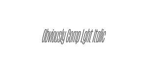
Obviously Blck Italic
Sans SerifDesigned by James Edmondson

Designed by James Edmondson
| Font Name | Obviously Demo Cond Semi |
| Style | Italic |
| Category | Sans Serif |
| Designer | James Edmondson |
| Copyright | N/A |
| License | Commercial/Retail License |
| Total Character | 66 |
| Recommended Line Height | 1.57 |
| Ascent | 1300 |
| Descent | 265 |
| Units Per em | 1000 |
| Total Vertical Range | 1565 |
| Max Advance Width | 486 |
| Max Advance Height | N/A |
| Underline Position | -75 |
| Similar Fonts | Impact, Knockout, Helvetica Compressed, Akzidenz-Grotesk |
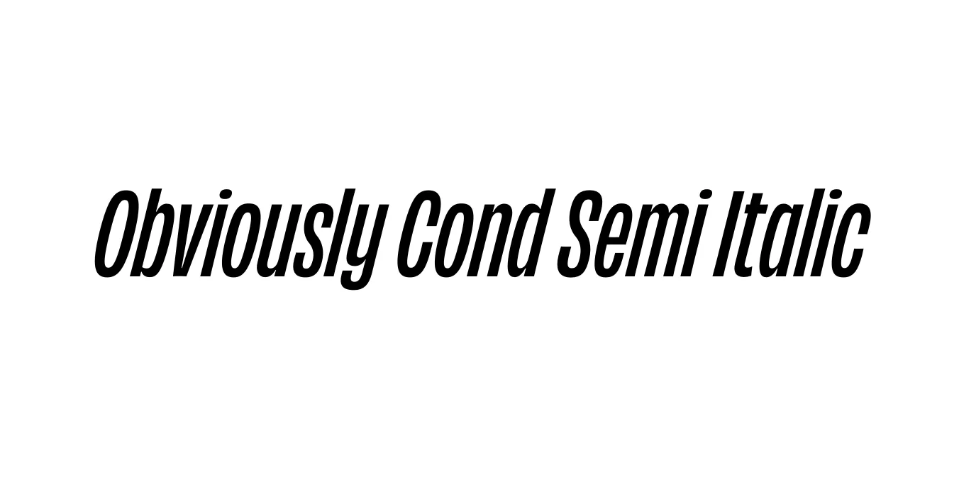
Obviously Cond Semi Italic is a striking component of the massive Obviously superfamily, meticulously crafted by James Edmondson of OH no Type Co. This typeface is a modern homage to the expressive, often eccentric American wood type and mid-century advertising styles. Unlike traditional sans-serifs that aim for clinical neutrality, Obviously embraces character and rhythm, offering a condensed profile that maximizes vertical impact while maintaining a sophisticated, narrow footprint.
The Semi Italic variation provides a unique kinetic energy, offering a slight forward lean that suggests motion without the extreme slant of a true italic. This makes it exceptionally versatile for layouts requiring a sense of urgency or direction without sacrificing legibility. Its sturdy construction and high x-height ensure that it remains clear and commanding in both digital environments and high-resolution print applications, making it a favorite for contemporary editorial design.
Perfect for punchy, space-saving headlines in print and digital ads.
Ideal for bold, contemporary logo designs that require a unique character.
Excellent for magazine pull-quotes and high-impact section headers.
Highly effective for hero banners and mobile-responsive typography.

Package Size: 8.4 KB
Available Formats: .OTF
Designed by James Edmondson
Designed by James Edmondson

Designed by James Edmondson
Designed by James Edmondson