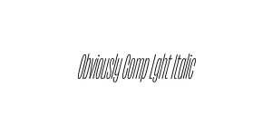
Obviously Blck Italic
Sans SerifDesigned by James Edmondson

Designed by James Edmondson
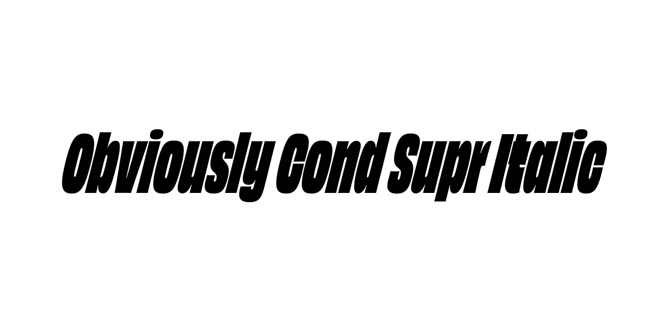
| Font Name | Obviously Demo Cond Supr |
| Style | Italic |
| Category | Sans Serif |
| Designer | James Edmondson |
| Copyright | N/A |
| License | Commercial / Paid (Check License) |
| Total Character | 66 |
| Recommended Line Height | 1.57 |
| Ascent | 1300 |
| Descent | 265 |
| Units Per em | 1000 |
| Total Vertical Range | 1565 |
| Max Advance Width | 460 |
| Max Advance Height | N/A |
| Underline Position | -75 |
| Similar Fonts | Impact, Acumin Pro, Helvetica Compressed, Industry, DDC Hardware |
Obviously Cond Supr Italic is a standout member of the massive Obviously type system created by James Edmondson of Ohno Type Co. This specific variant combines a condensed width with a super-heavy weight and a sharp italic slant, designed to evoke a sense of high-velocity impact and modern urgency. Drawing inspiration from 20th-century American sign painting and mid-century advertising, it sheds the sterile nature of traditional grotesques in favor of something with more character and 'flavor'.
The typeface is known for its extreme versatility and unique construction, where even at its heaviest weights like Super, the counters remain clear and the rhythm remains consistent. The italic angle adds a kinetic energy that makes it ideal for digital interfaces, editorial headlines, and large-scale environmental graphics. It has quickly become a staple for designers looking to balance vintage aesthetics with contemporary bold design trends.
Excellent for high-contrast titles in magazine layouts and digital articles.
The aggressive slant and heavy weight convey speed and power for athletic logos.
Perfect for bold event posters that require high visibility from a distance.
Ideal for creating punchy, thumb-stopping graphics on Instagram or TikTok.

Package Size: 8.4 KB
Available Formats: .OTF
Designed by James Edmondson
Designed by James Edmondson

Designed by James Edmondson
Designed by James Edmondson