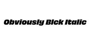
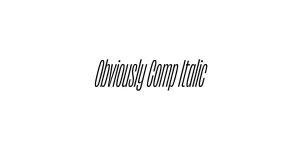
Obviously Blck Italic
Sans SerifDesigned by James Edmondson
Designed by James Edmondson
| Font Name | Obviously Demo Extd Lght |
| Style | Italic |
| Category | Sans Serif |
| Designer | James Edmondson |
| Copyright | N/A |
| License | Personal Use Only |
| Total Character | 66 |
| Recommended Line Height | 1.57 |
| Ascent | 1300 |
| Descent | 265 |
| Units Per em | 1000 |
| Total Vertical Range | 1565 |
| Max Advance Width | 1778 |
| Max Advance Height | N/A |
| Underline Position | -75 |
| Similar Fonts | Eurostile, Microgramma, Avenue Mono, Squada One |
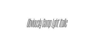
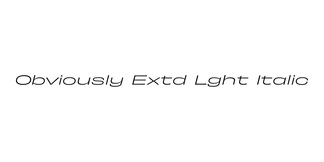
Obviously is a versatile and expressive sans-serif family designed by James Edmondson of OH no Type Co. The extended light italic variant specifically pushes the boundaries of horizontal space, offering a sleek, modern, and high-energy aesthetic. It was inspired by the wide, geometric lettering found in mid-20th-century American signage and automotive branding, blending retro nostalgia with a contemporary, digital-first precision.
The Obviously Extd Lght Italic style is characterized by its dramatic width and subtle slant, creating a sense of forward motion and sophistication. Its design focuses on clarity even at extreme widths, making it a favorite for designers looking to make a bold statement in editorial layouts or brand identities. The family as a whole includes a vast range of widths and weights, allowing for a cohesive typographic system that scales from tiny captions to massive, cinematic headlines.
Perfect for wide, impactful titles that require a modern, high-energy edge.
Ideal for tech or automotive brands seeking a sense of speed and spaciousness.
Great for magazine spreads and high-fashion layouts where horizontal emphasis is needed.

Package Size: 9.2 KB
Available Formats: .OTF
Designed by James Edmondson
Designed by James Edmondson
Designed by James Edmondson
Designed by James Edmondson