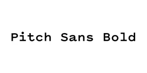
Pitch Sans Bold
Sans SerifDesigned by Kris Sowersby
Designed by Sol Hess

| Font Name | Twentieth Century |
| Style | Bold |
| Category | Geometric Sans-Serif |
| Designer | Sol Hess |
| Copyright | Copyright (C) 1937 Lanston Monotype. All Rights Reserved |
| License | Free for Personal Use |
| Total Character | 223 |
| Recommended Line Height | 1.09 |
| Ascent | 1753 |
| Descent | 477 |
| Units Per em | 2048 |
| Total Vertical Range | 2230 |
| Max Advance Width | 2560 |
| Max Advance Height | N/A |
| Underline Position | -272 |
| Similar Fonts | Futura, Spartan, ITC Avant Garde Gothic, Kabel |
Twentieth Century Bold is an iconic geometric sans-serif typeface designed by Sol Hess for Lanston Monotype between 1937 and 1947. It was originally created as a direct competitor to Paul Renner's Futura, adhering to the Bauhaus principles of using primary geometric shapes—circles and squares—as the foundation for its letterforms. This results in a clean, balanced, and highly legible font that embodies the modernist aesthetic of the mid-20th century.
The Bold weight of this family is particularly noted for its industrial strength and clarity, making it a staple for corporate branding, editorial headlines, and high-impact advertising. Because of its mathematical precision and lack of ornamentation, Twentieth Century Bold remains a timeless choice for designers who require a typeface that conveys both authority and modern sophistication across both print and digital platforms.
Ideal for creating strong, minimalist corporate logos and brand identities.
Perfect for bold, eye-catching titles in magazines, posters, and web banners.
Commonly used in promotional materials to convey a sense of modernism and trust.
High legibility makes it excellent for wayfinding and large-scale architectural displays.

Package Size: 44.3 KB
Available Formats: .TTF
Designed by Kris Sowersby
Designed by Cyrus Highsmith

Designed by Alan Meeks

Designed by Sol Hess