EFCO Overhold Regular
SerifDesigned by Gilang Gemilang (Ephemera Font Collection)

Designed by Tobias Frere-Jones
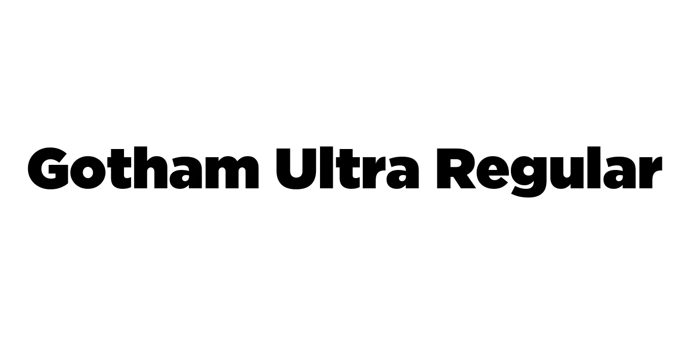
| Font Name | Gotham Ultra |
| Style | Regular |
| Category | Geometric Sans Serif |
| Designer | Tobias Frere-Jones |
| Copyright | Copyright (C) 2001, 2008 Hoefler & Frere-Jones. http://www.typography.com |
| License | Commercial License Required |
| Total Character | 229 |
| Recommended Line Height | 1.11 |
| Ascent | 932 |
| Descent | 173 |
| Units Per em | 1000 |
| Total Vertical Range | 1105 |
| Max Advance Width | 1349 |
| Max Advance Height | N/A |
| Underline Position | -123 |
| Similar Fonts | Montserrat, Proxima Nova, Nexa, Avenir |
Gotham Ultra Regular is an iconic component of the broader Gotham typeface family, which was originally commissioned by GQ magazine in 2000. Designer Tobias Frere-Jones sought inspiration from the architectural lettering and no-nonsense signage found throughout New York City, particularly the Port Authority Bus Terminal. This heritage gives the font a distinctly American, geometric, and urban personality that feels both timeless and modern.
The Ultra weight is the most authoritative and heavy iteration of the family, designed specifically for maximum visual impact. It reached a pinnacle of cultural significance during the 2008 US Presidential election, where its clean, assertive lines helped define a new era of political branding. Because of its massive stroke weight and balanced proportions, it remains a top choice for designers who need to convey strength, confidence, and sophistication in high-profile displays.
Commanding attention in magazines and editorial layouts.
Creating strong and trustworthy corporate identities.
High visibility for large-scale print and outdoor advertising.
Crafting heavy, memorable wordmarks for modern brands.

Designed by Gilang Gemilang (Ephemera Font Collection)
Designed by Tobias Frere-Jones

Designed by Tobias Frere-Jones

Designed by Tobias Frere-Jones