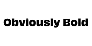
Obviously Bold
Sans Serif / DisplayDesigned by James Edmondson
Designed by James Edmondson
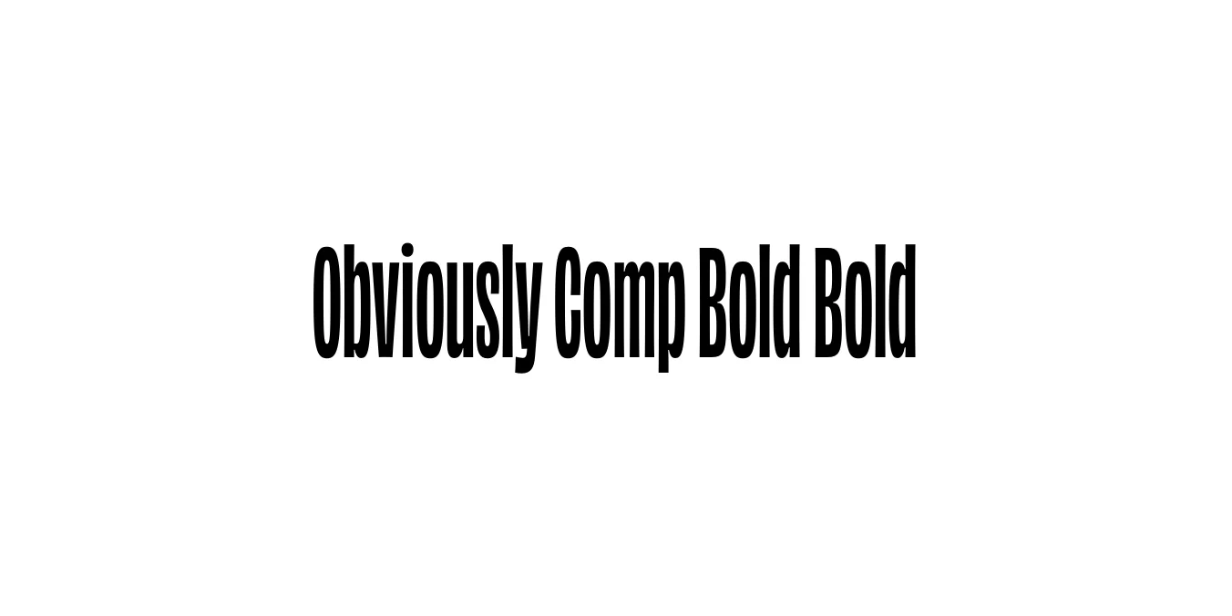
| Font Name | Obviously Demo Comp Bold |
| Style | Bold |
| Category | Sans Serif |
| Designer | James Edmondson |
| Copyright | N/A |
| License | Free for Personal Use |
| Total Character | 66 |
| Recommended Line Height | 1.57 |
| Ascent | 1300 |
| Descent | 265 |
| Units Per em | 1000 |
| Total Vertical Range | 1565 |
| Max Advance Width | 304 |
| Max Advance Height | N/A |
| Underline Position | -75 |
| Similar Fonts | Impact, Compacta, Helvetica Compressed |
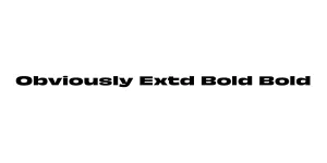
Obviously Comp Bold Bold is a standout member of the extensive Obviously typeface family, designed by James Edmondson at OH no Type Co. Inspired by the raw, energetic lettering found on mid-century American signage and grocery store advertisements, this font captures a unique balance between retro charm and contemporary utility. It was built to solve the need for a versatile sans-serif that doesn't lose its personality when scaled or compressed.
The Compressed Bold weight is specifically engineered for high-impact display environments where horizontal space is at a premium. With its heavy stroke weight and tight apertures, it commands attention in editorial layouts, massive posters, and digital headers. Despite its extreme proportions, the typeface maintains exceptional legibility and a confident, rhythmic flow that makes it a favorite for modern branding projects.
Perfect for massive, attention-grabbing titles in magazines or posters.
Ideal for bold logos that need a vintage yet modern feel.
Excellent for high-contrast graphics and punchy, short captions.
Great for promotional materials that require a strong, authoritative voice.

Package Size: 7.4 KB
Available Formats: .OTF
Designed by James Edmondson
Designed by James Edmondson
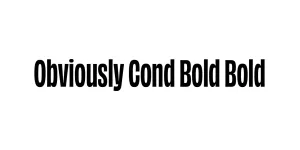
Designed by James Edmondson