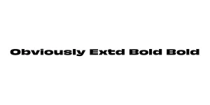
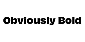
Obviously Bold
Sans Serif / DisplayDesigned by James Edmondson
Designed by James Edmondson
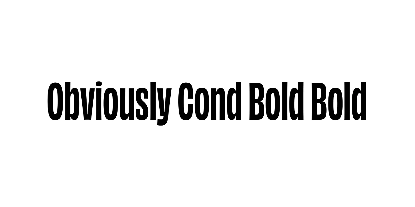
| Font Name | Obviously Demo Cond Bold |
| Style | Bold |
| Category | Sans Serif |
| Designer | James Edmondson |
| Copyright | N/A |
| License | Free for Personal Use / Demo |
| Total Character | 66 |
| Recommended Line Height | 1.57 |
| Ascent | 1300 |
| Descent | 265 |
| Units Per em | 1000 |
| Total Vertical Range | 1565 |
| Max Advance Width | 476 |
| Max Advance Height | N/A |
| Underline Position | -75 |
| Similar Fonts | Helvetica, Impact, Antique Olive, Acumin |
Obviously Cond Bold was designed by James Edmondson and released through his foundry, OH no Type Co. The typeface is a masterclass in flexibility, drawing inspiration from mid-century American signage while avoiding the pitfalls of over-used neo-grotesques. It captures a specific sense of 20th-century optimism, balancing quirkiness with extreme functionality across its massive family of widths and weights.
This condensed bold variant is particularly impactful, offering a high-energy, high-contrast aesthetic that commands attention without feeling dated. Its tight apertures and sturdy construction make it a favorite for modern branding and editorial design where space is at a premium but personality is required. Obviously stands out by being both familiar and entirely fresh in the crowded world of sans-serif fonts.
Perfect for loud, attention-grabbing titles and hero sections.
Ideal for creating strong, recognizable brand identities and logos.
High impact for event marketing and large-scale print graphics.
Excellent for magazine covers and punchy subheadings.

Designed by James Edmondson
Designed by James Edmondson
Designed by James Edmondson