Obviously Blck Regular
Sans SerifDesigned by James Edmondson

Designed by James Edmondson

| Font Name | Obviously Demo Comp Medi |
| Style | Regular |
| Category | Sans Serif |
| Designer | James Edmondson |
| Copyright | N/A |
| License | Free for Personal Use / Demo |
| Total Character | 66 |
| Recommended Line Height | 1.57 |
| Ascent | 1300 |
| Descent | 265 |
| Units Per em | 1000 |
| Total Vertical Range | 1565 |
| Max Advance Width | 296 |
| Max Advance Height | N/A |
| Underline Position | -75 |
| Similar Fonts | Impact, Druk Condensed, Compacta, Helvetica Compressed |
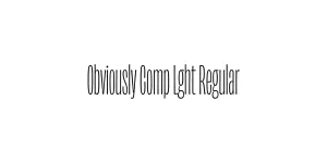
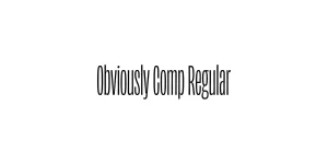
Obviously Comp Medi Regular is a part of the expansive Obviously typeface system designed by James Edmondson and released through the OH no Type Co. This specific variant belongs to the Compressed subfamily, which was engineered to provide maximum impact in horizontally restricted spaces. The typeface draws heavy inspiration from the soulful, hand-painted signs of the mid-20th century while maintaining a clean, digital-first construction that feels both nostalgic and futuristic.
The Medium weight of the Compressed width is particularly notable for its balanced stroke thickness, which ensures high legibility even when the characters are tightly packed. It avoids the clutter often associated with narrow fonts by utilizing precise geometric forms and intentional apertures. This makes it a favorite among contemporary graphic designers for editorial layouts, bold branding, and high-energy advertising campaigns where space is at a premium but character is non-negotiable.
Ideal for punchy, vertical-heavy titles in magazines and posters.
Excellent for creating distinctive wordmarks for tech and lifestyle brands.
Works perfectly for event flyers where large text must fit into tight margins.
Great for eye-catching Instagram stories and bold overlay text.

Package Size: 7.2 KB
Available Formats: .OTF
Designed by James Edmondson
Designed by James Edmondson
Designed by James Edmondson

Designed by James Edmondson