Obviously Blck Regular
Sans SerifDesigned by James Edmondson

Designed by James Edmondson
| Font Name | Obviously Demo Comp |
| Style | Regular |
| Category | Sans Serif |
| Designer | James Edmondson |
| Copyright | N/A |
| License | Free for Personal Use |
| Total Character | 66 |
| Recommended Line Height | 1.57 |
| Ascent | 1300 |
| Descent | 265 |
| Units Per em | 1000 |
| Total Vertical Range | 1565 |
| Max Advance Width | 281 |
| Max Advance Height | N/A |
| Underline Position | -75 |
| Similar Fonts | Impact, Compacta, Helvetica Compressed, Schmalfette CP |
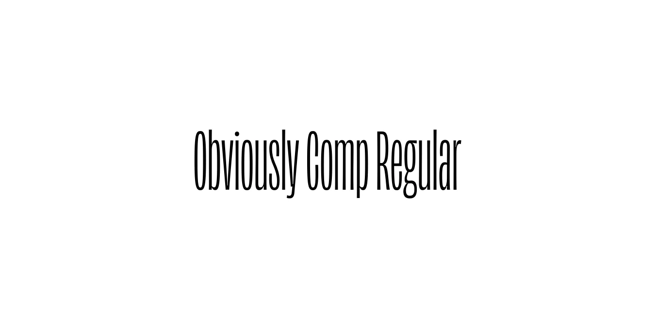
Obviously Comp Regular is a standout member of the expansive Obviously family, meticulously designed by James Edmondson of the Ohno Type Co. Released in 2018, this font was conceived to tackle the challenge of fitting maximal character into minimal horizontal space. It draws its soul from the raw, unpolished energy of 20th-century vernacular signage and vinyl lettering, stripping away unnecessary ornamentation to focus on pure, compressed impact.
The design of the Compressed Regular weight features extremely tight apertures and a rigid, almost rectangular structure that creates a powerful vertical rhythm. Despite its industrial and utilitarian roots, Edmondson infused the typeface with a contemporary personality that avoids the sterile feel of traditional grotesques. It is a preferred choice for designers who need a typeface that speaks loudly and clearly within the constraints of modern digital and print layouts.
Ideal for bold, tall headings where horizontal space is at a premium.
Creates a striking visual presence that is legible from great distances.
Perfect for magazine mastheads and high-impact pull quotes.
Excellent for creating thumb-stopping graphic overlays on Instagram and TikTok.

Package Size: 7.2 KB
Available Formats: .OTF
Designed by James Edmondson
Designed by James Edmondson
Designed by James Edmondson
Designed by James Edmondson