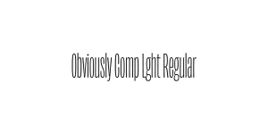
Obviously Blck Regular
Sans SerifDesigned by James Edmondson

Designed by James Edmondson

| Font Name | Obviously Demo Comp Semi |
| Style | Regular |
| Category | Sans Serif |
| Designer | James Edmondson |
| Copyright | N/A |
| License | Free for Personal Use |
| Total Character | 66 |
| Recommended Line Height | 1.57 |
| Ascent | 1300 |
| Descent | 265 |
| Units Per em | 1000 |
| Total Vertical Range | 1565 |
| Max Advance Width | 311 |
| Max Advance Height | N/A |
| Underline Position | -75 |
| Similar Fonts | Impact, Compacta, Titling Gothic FB, Helvetica Compressed |
Obviously Comp Semi Regular is a striking member of the expansive Obviously font family, designed by James Edmondson for the Ohno Type Co. Created to inject personality back into the often sterile world of grotesque sans serifs, this typeface takes inspiration from the flexible nature of vinyl lettering and hand-painted signage. The Compressed width is masterfully engineered to maintain legibility while occupying minimal horizontal space, making it a powerful tool for modern graphic designers.
Released as part of a system that ranges from wide to ultra-narrow, the Semi Regular weight offers a sophisticated middle ground that provides enough visual weight for impact without the heaviness of a bold. With its high x-height and contemporary construction, Obviously Comp Semi Regular is frequently used in high-end editorial layouts and energetic branding projects that require a unique, authoritative voice that breaks away from traditional Swiss design norms.
Perfect for bold, space-saving titles in magazines or digital hero sections.
Excellent for high-impact vertical layouts where horizontal real estate is limited.
Ideal for creating strong, modern identities for sports, tech, or lifestyle brands.
Great for UI elements that need to convey authority in narrow mobile screen constraints.

Package Size: 7.2 KB
Available Formats: .OTF
Designed by James Edmondson
Designed by James Edmondson
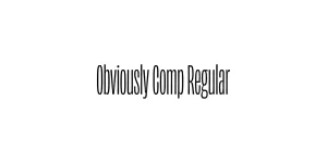
Designed by James Edmondson

Designed by James Edmondson