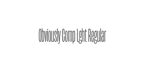
Obviously Blck Regular
Sans SerifDesigned by James Edmondson

Designed by James Edmondson
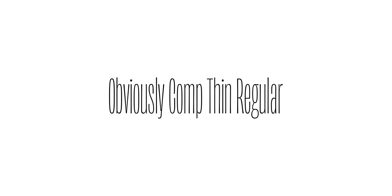
| Font Name | Obviously Demo Comp Thin |
| Style | Regular |
| Category | Sans Serif |
| Designer | James Edmondson |
| Copyright | N/A |
| License | Demo |
| Total Character | 66 |
| Recommended Line Height | 1.57 |
| Ascent | 1300 |
| Descent | 265 |
| Units Per em | 1000 |
| Total Vertical Range | 1565 |
| Max Advance Width | 268 |
| Max Advance Height | N/A |
| Underline Position | -75 |
| Similar Fonts | Impact, Helvetica Compressed, Bureau Grot, Industry |
Obviously was designed by James Edmondson of OH no Type Co and released in 2018. The typeface was born out of a desire to create a sans serif family that could handle high-intensity branding with a flexible range of widths, from ultra-wide to incredibly compressed. The Compressed Thin weight specifically offers a sleek, vertical elegance that maintains high legibility while occupying minimal horizontal space.
The design of Obviously Comp Thin Regular draws inspiration from mid-century American advertising and geometric grotesques but adds a contemporary, slightly irreverent twist. It is particularly effective in environments where space is at a premium, such as mobile UI, editorial layouts, and luxury branding. Its sharp terminals and consistent stroke weight provide a modern, architectural feel that stands out in both digital and print mediums.
Perfect for headlines in magazines and newspapers where horizontal space is tight.
Great for eye-catching vertical text overlays on mobile stories and posts.
Ideal for minimalist website hero sections that require a sophisticated, architectural touch.
The thin strokes offer an elegant, high-end feel for fashion or tech-focused brands.

Package Size: 7.0 KB
Available Formats: .OTF
Designed by James Edmondson
Designed by James Edmondson
Designed by James Edmondson

Designed by James Edmondson