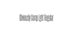
Obviously Blck Regular
Sans SerifDesigned by James Edmondson

Designed by James Edmondson

| Font Name | Obviously Demo Cond Supr |
| Style | Regular |
| Category | Sans-Serif Condensed |
| Designer | James Edmondson |
| Copyright | N/A |
| License | Demo / Paid |
| Total Character | 66 |
| Recommended Line Height | 1.57 |
| Ascent | 1300 |
| Descent | 265 |
| Units Per em | 1000 |
| Total Vertical Range | 1565 |
| Max Advance Width | 460 |
| Max Advance Height | N/A |
| Underline Position | -75 |
| Similar Fonts | Eurostile Condensed, Impact, Druk Condensed |
Obviously is a versatile and expressive sans-serif family designed by James Edmondson for OH no Type Co. It draws inspiration from mid-century American signage and the bold, idiosyncratic lettering found in 1950s and 60s advertisements. The Condensed Super weight specifically pushes the limits of verticality, offering a narrow but impactful presence that demands attention without sacrificing legibility.
The design is characterized by its wide range of widths and weights, allowing for extreme typographic flexibility. Obviously Cond Supr Regular is particularly well-suited for high-impact display work where space is at a premium. Its unique blend of nostalgic charm and modern construction makes it a favorite among contemporary graphic designers looking for a typeface that bridges the gap between retro and futuristic aesthetics.
Perfect for tall, narrow headlines in magazines and newspapers.
High-impact vertical text for event or promotional posters.
Unique logotypes requiring a distinctive, condensed character.
Efficient use of vertical space on narrow product containers.

Designed by James Edmondson
Designed by James Edmondson
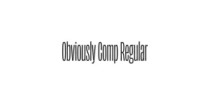
Designed by James Edmondson

Designed by James Edmondson